Frolicious Delights
The Brief
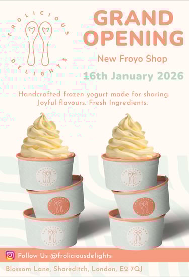
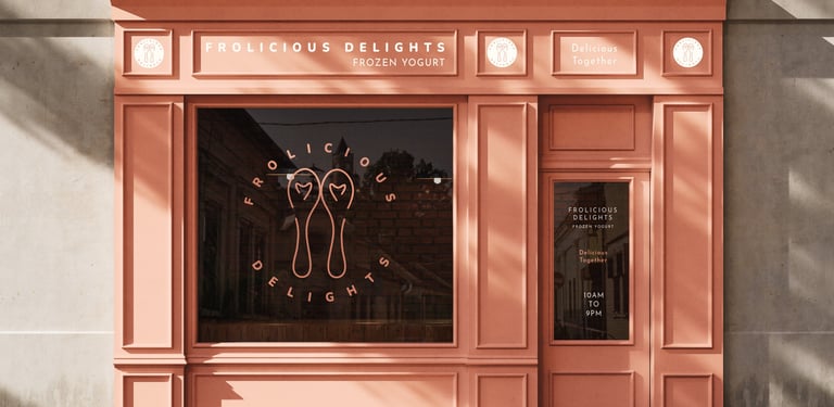
Frolicious Delights is a small corner shop specialising in authentic frozen yoghurt. High quality, real ingredients, affordable price.
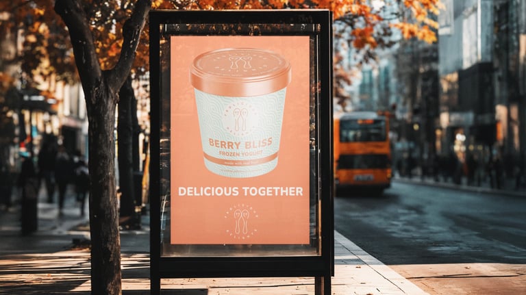
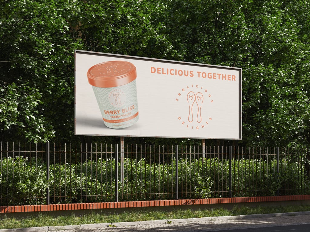
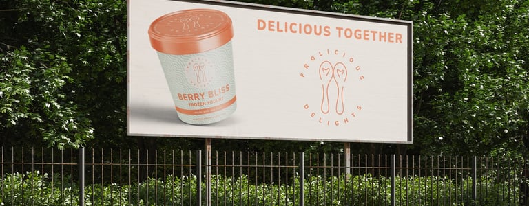
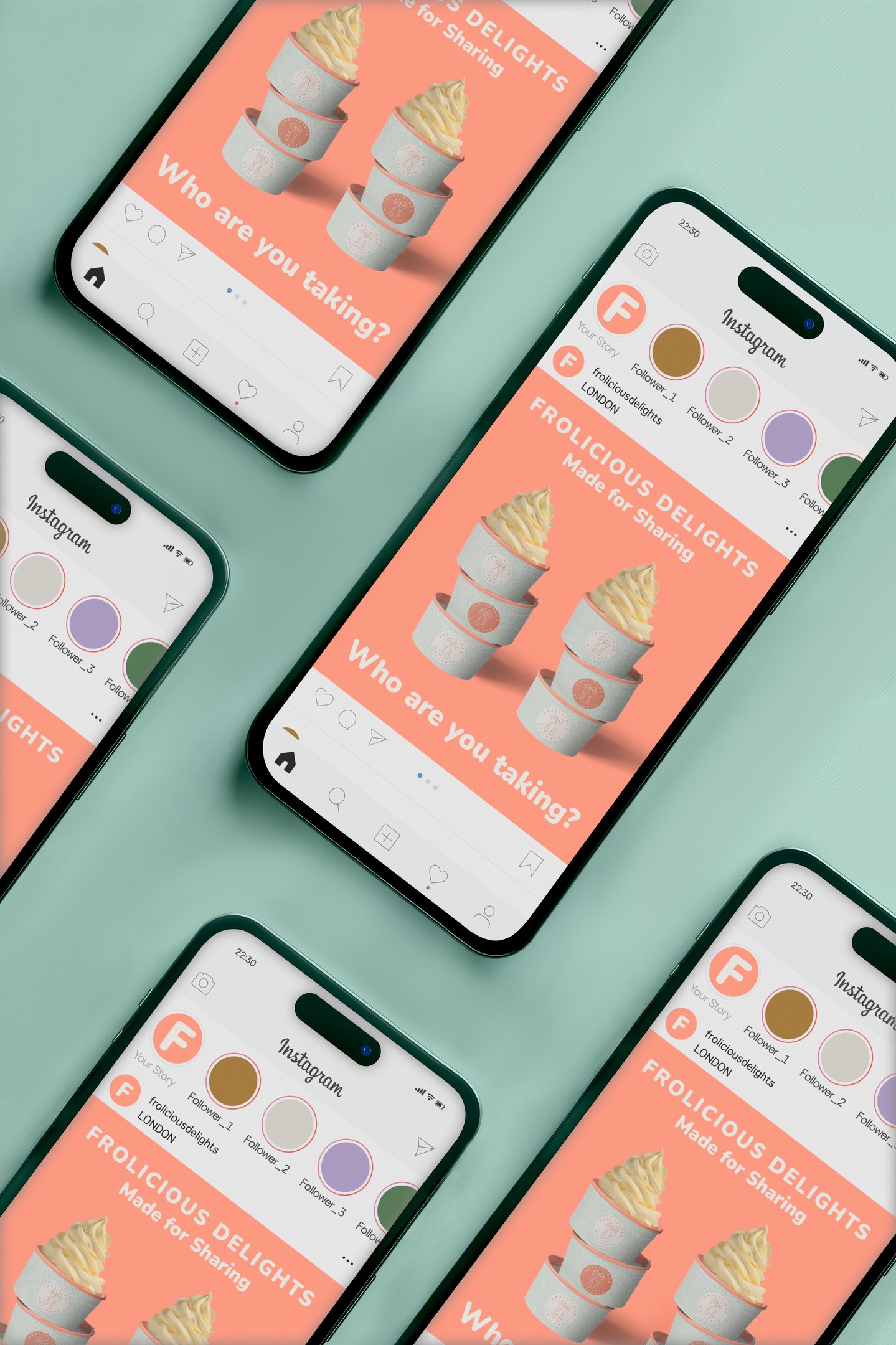
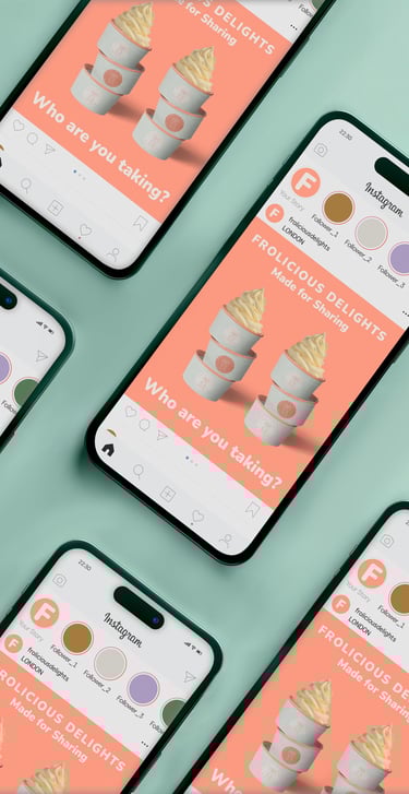
The brand needed a complete visual identity and launch campaign that would stand out in a crowded market and appeal to couples aged 20-45 looking for a sweet shared experience.
The Thinking
Most frozen yoghurt brands rely on bright, high intensity colours - hot pinks, neons, cyans. Eye catching but overwhelming and all starting to look the same.
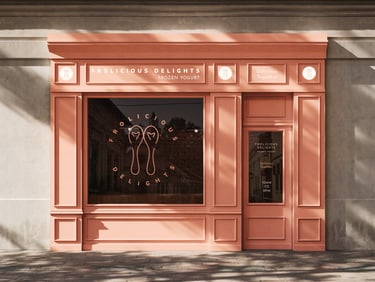
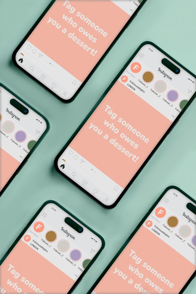
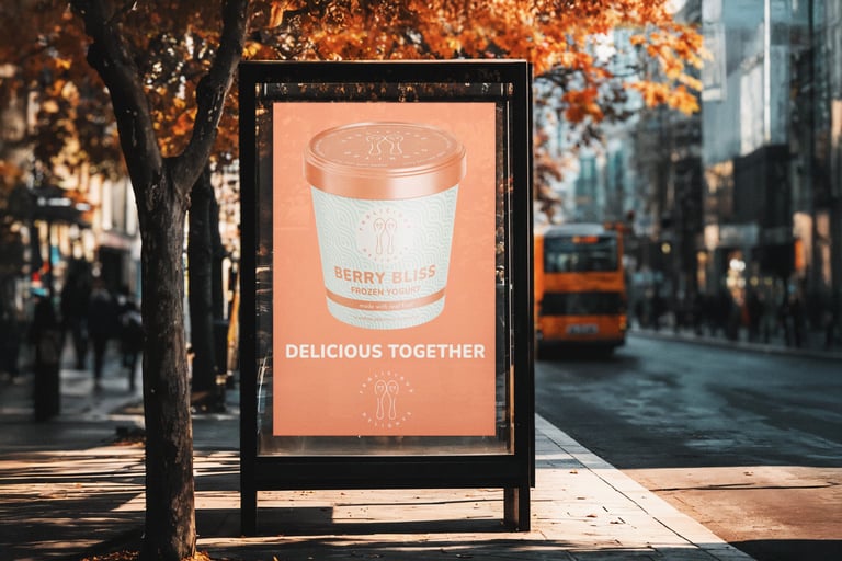
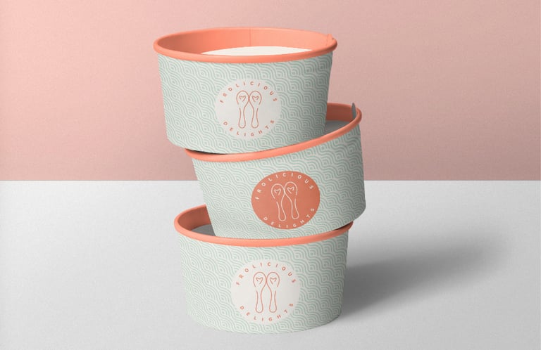
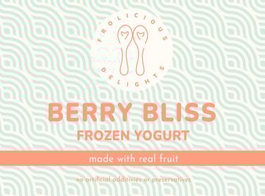
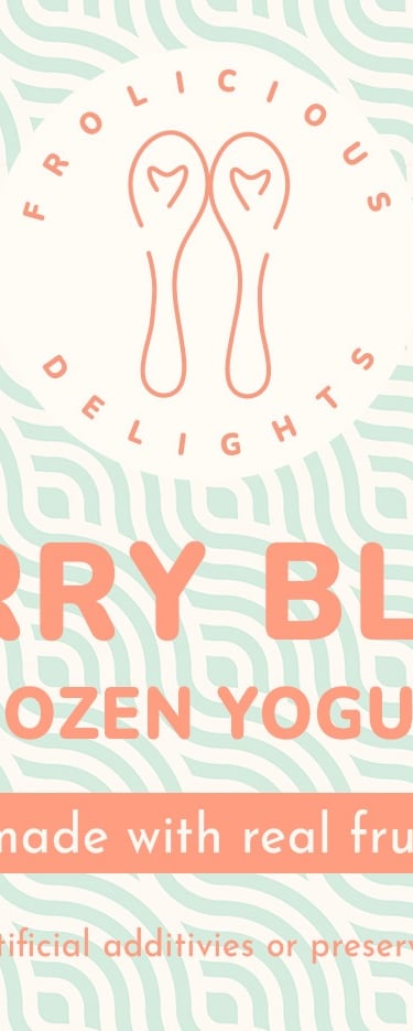
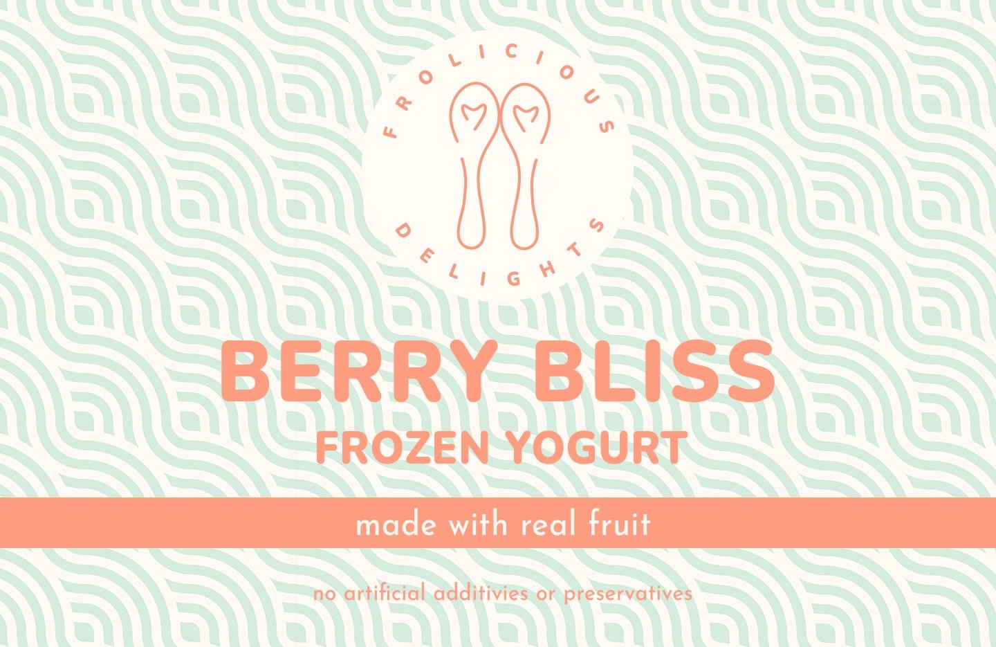
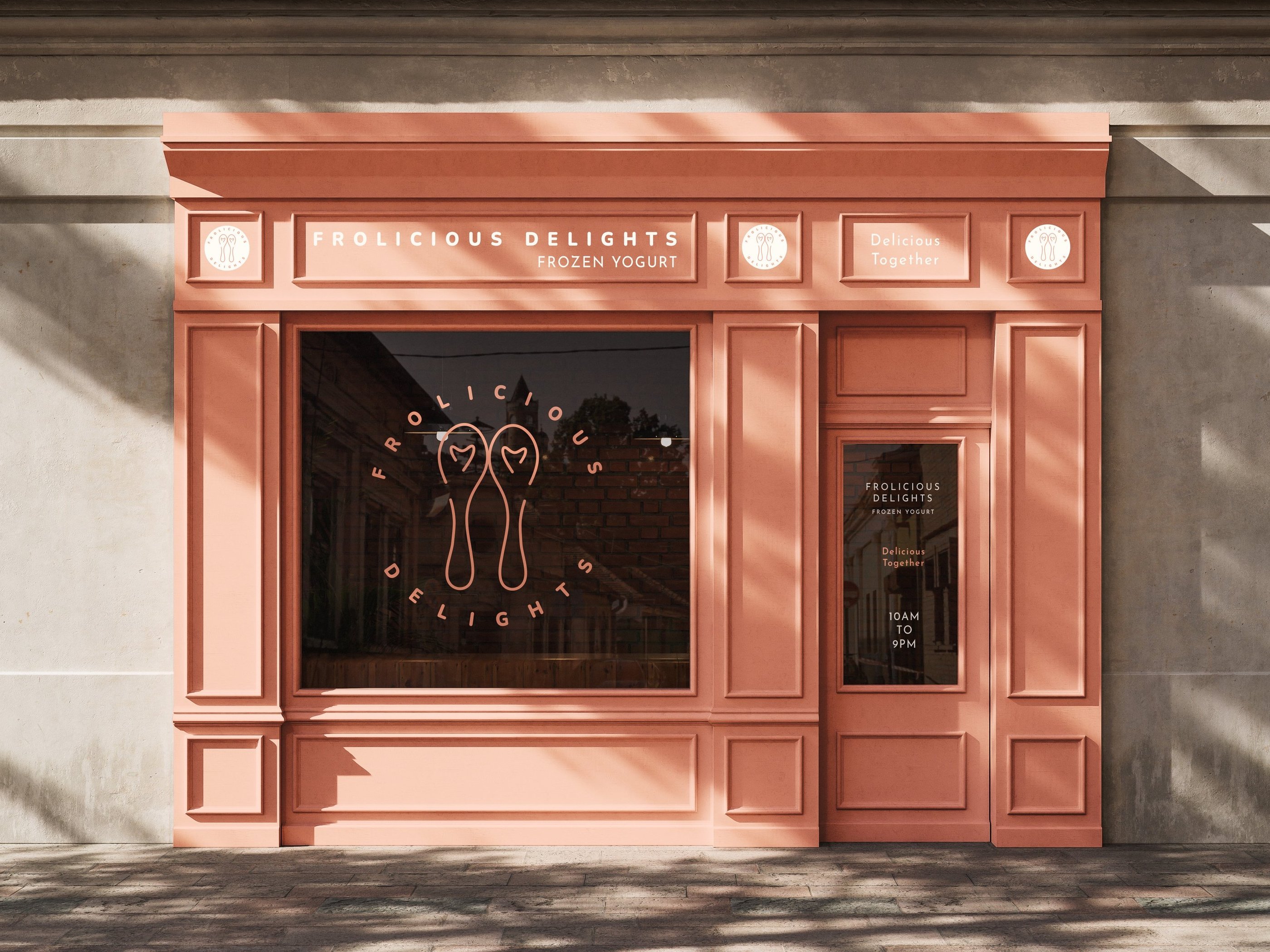
The decision was to go the opposite direction; a warm pastel palette. Peach to encourage appetite, soft cream to avoid stark contrast, pale mint green inspired by modern cafe aesthetics. Fresh and modern without shouting.
The logo mark, two spoons forming a heart, captures the brand's idea of shared enjoyment. Simple, recognisable and scalable from a sticker to a shopfront.