Align Tea
The Brief
A wellness tea brand with no name, no logo, no visual identity. Everything needed creating from scratch.
The target customer is wellness-focused and eco-conscious, someone who treats self-care as a daily ritual and wants a brand that feels like an investment in their health, not just a cuppa.
The Thinking
The wellness tea aisle is crowded with packaging that all seem to blur together.
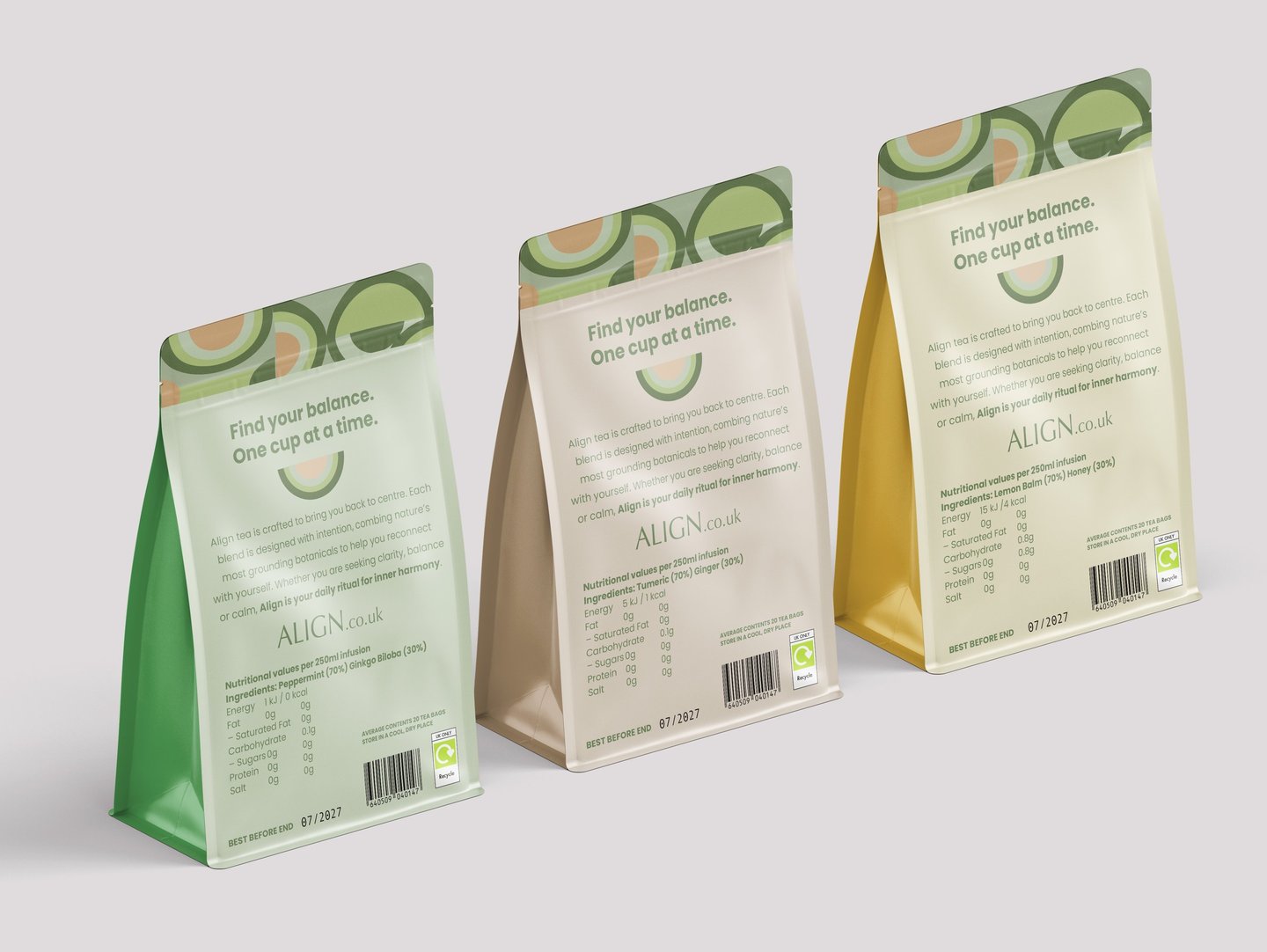
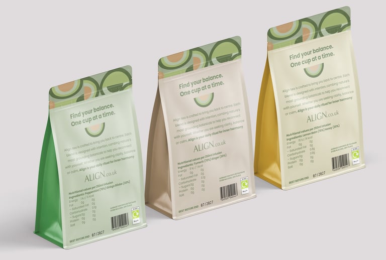
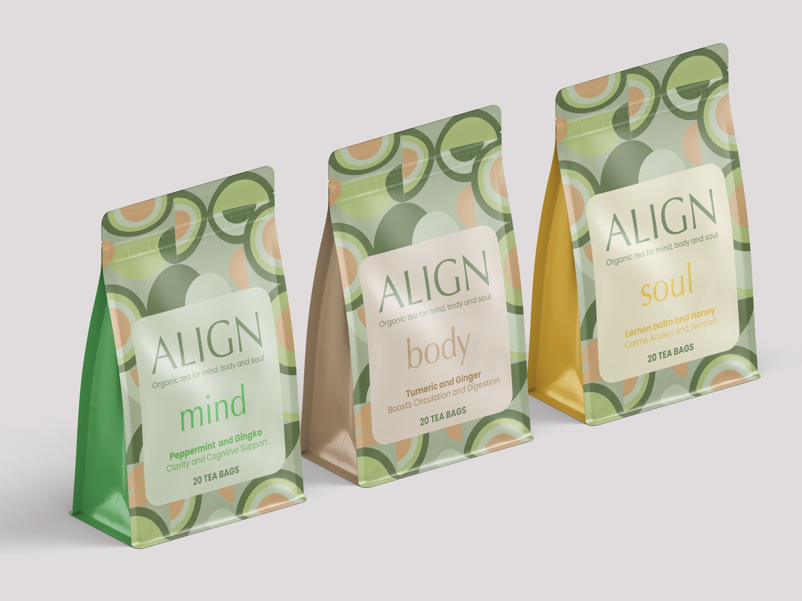
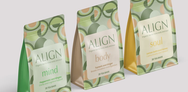
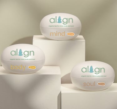
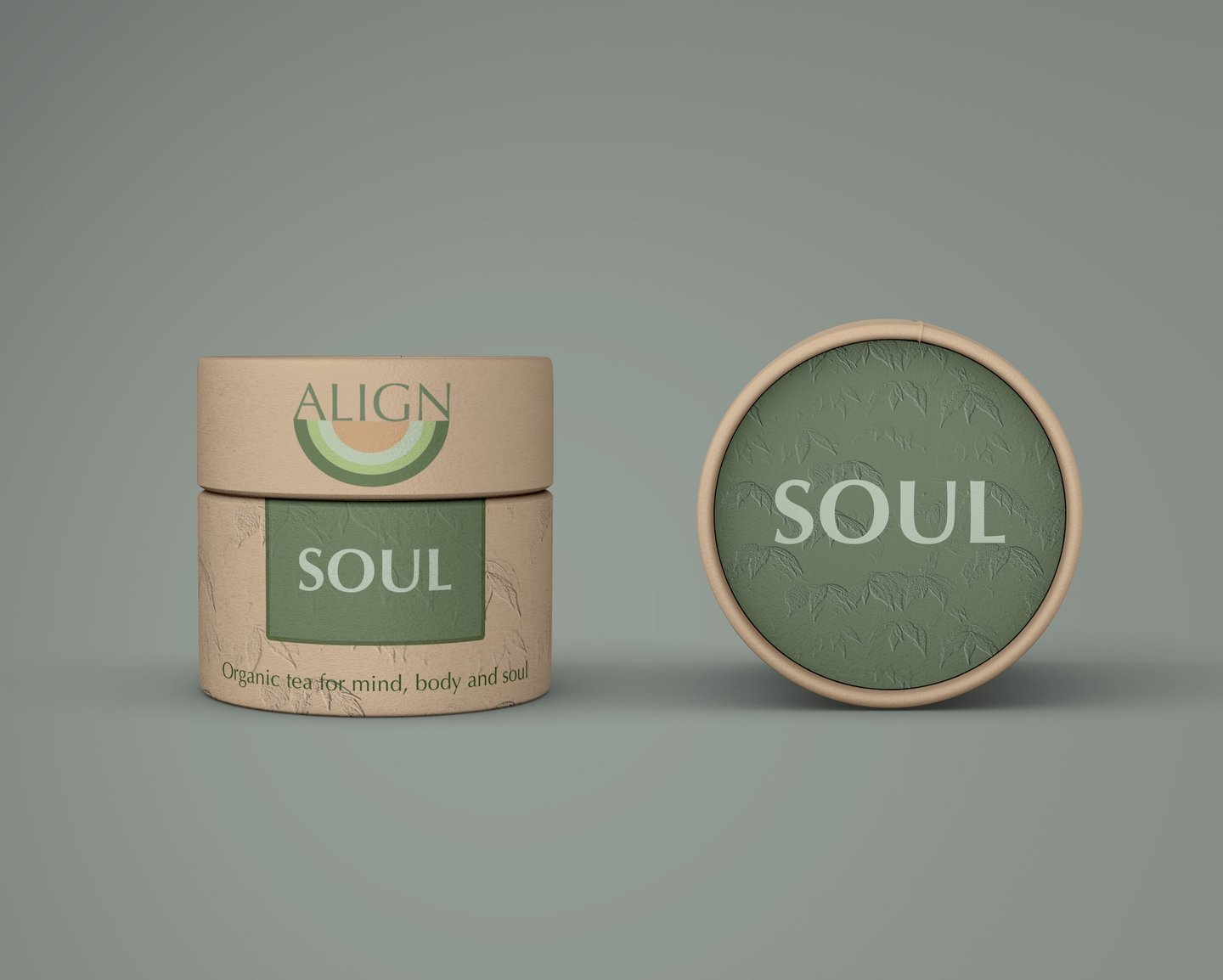
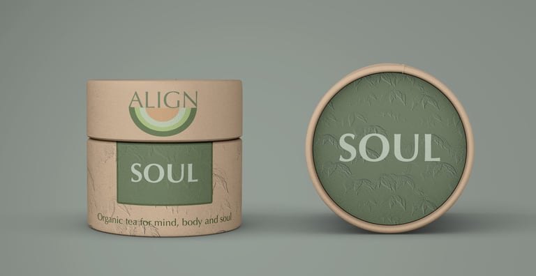
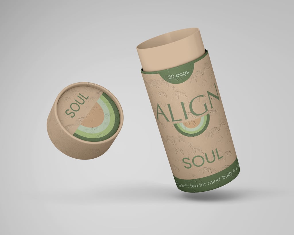
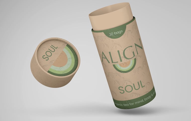
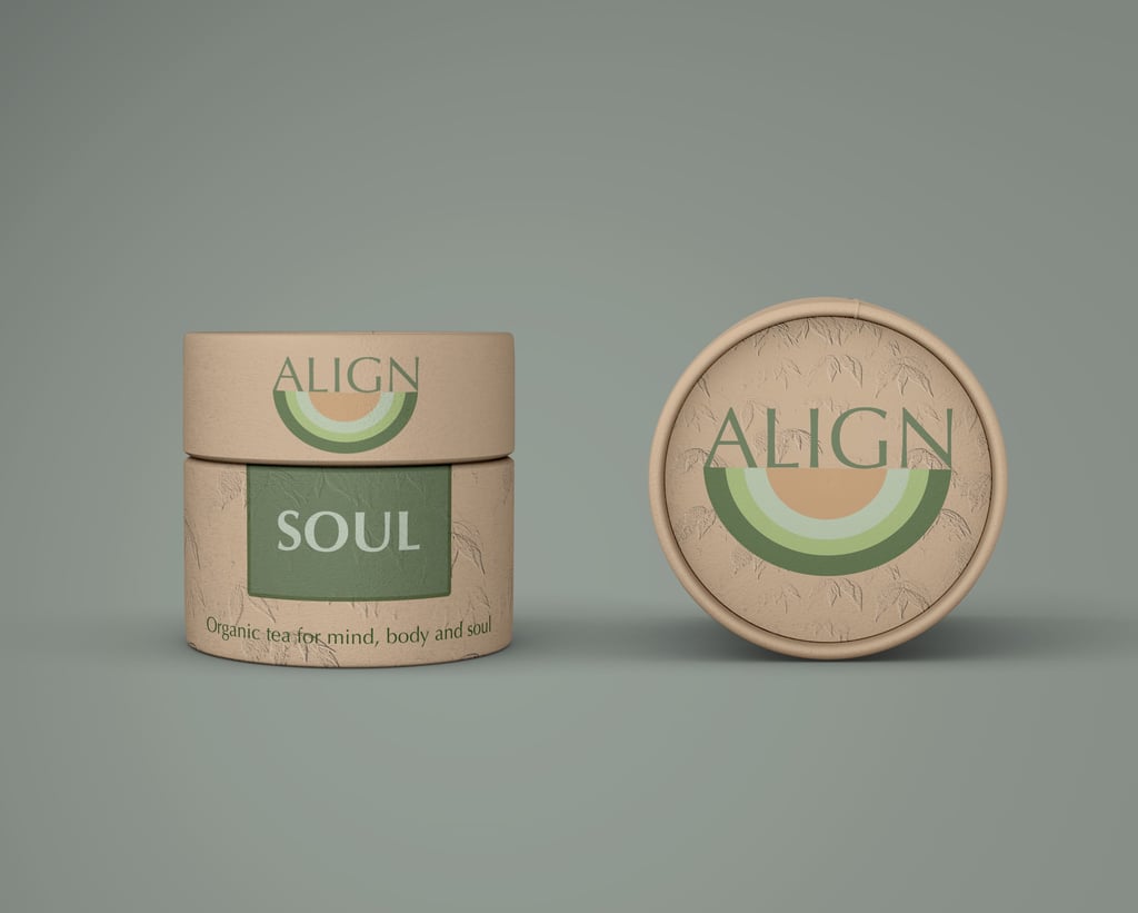
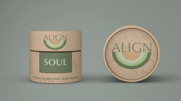
The decision was to make Align feel more like a beauty product than traditional tea; something worth displaying rather than hiding in the cupboard.
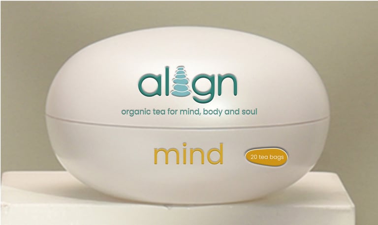
I explored three concepts. The first used stacked pebbles forming the 'i' in Align, with reusable containers designed to feel spa-like and stackable.
The second developed a semi-circle brand mark representing balance, playful yet meaningful, applied to embossed recycled cardboard tubes that felt premium without compromising on sustainability.
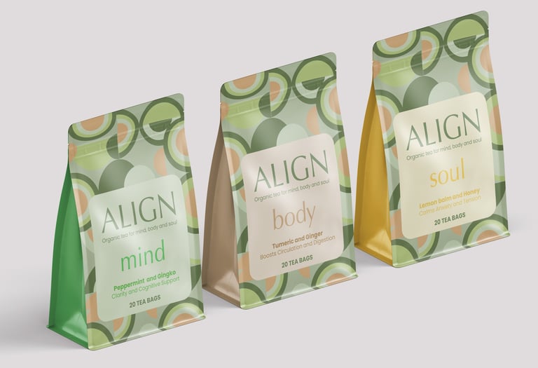
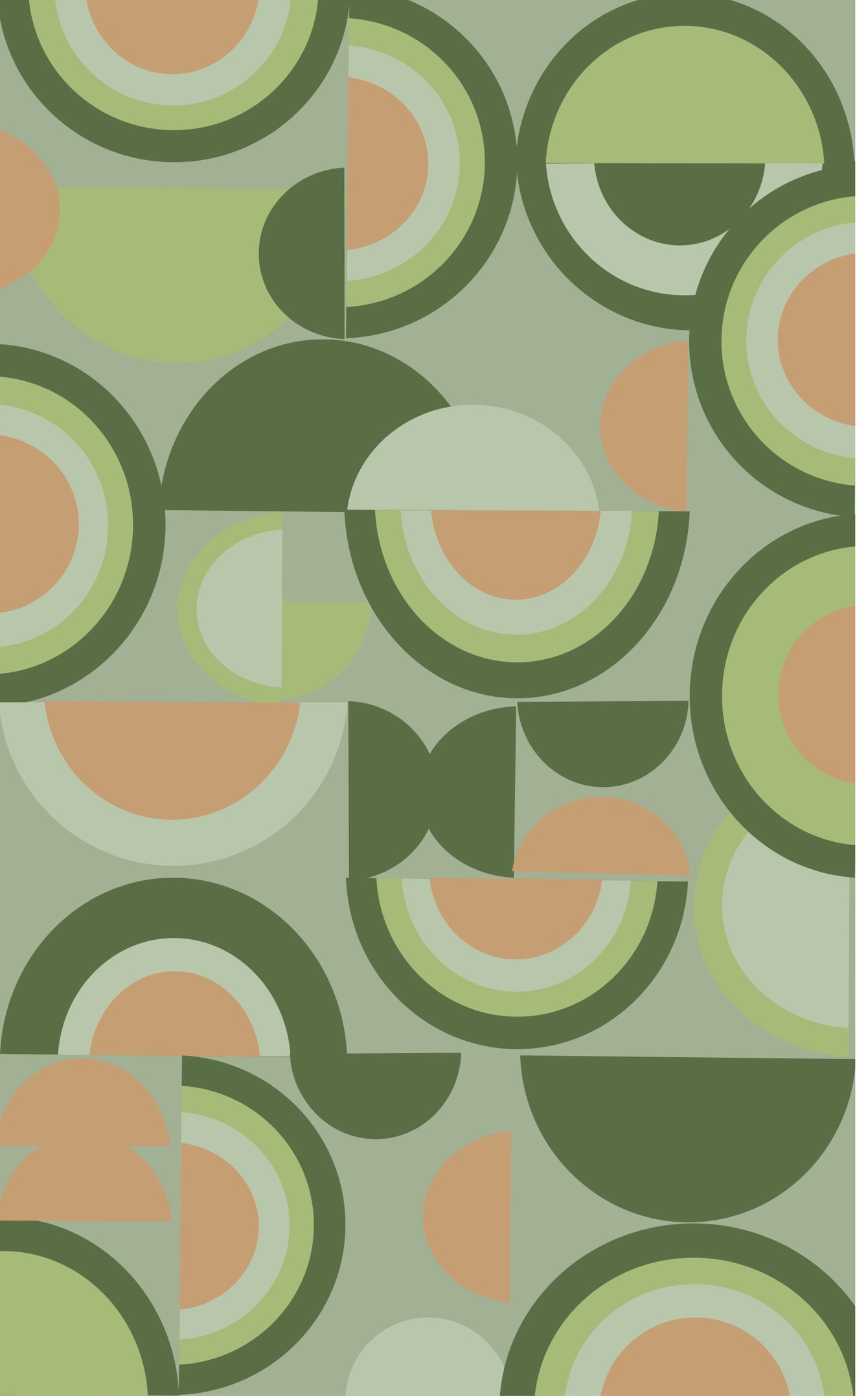
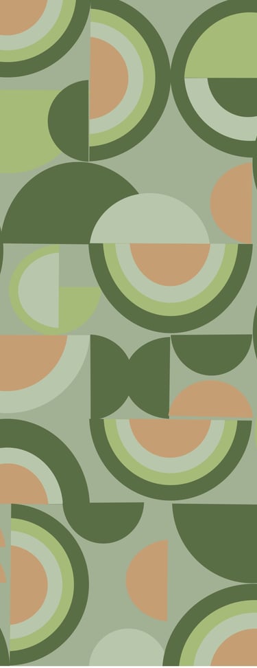
The final concept took that semi-circle and turned it into a bold geometric pattern across resealable recyclable pouches. Visually striking enough to stand out on the tea aisle, while staying true to the eco-values of the target customer.


Like what you see?